Quick Summary: Learn the key differences between RGB, CMYK, and Pantone color systems to ensure brand consistency across digital and print materials.
Have you ever printed a design only to realize the colors look completely different from what you saw on your screen? This is a common frustration for brands that don’t fully understand how colors translate between digital and print. Without careful planning, your brand colors may look inconsistent across websites, business cards, packaging, and marketing materials—leading to a less polished and professional image. Understanding RGB, CMYK, and Pantone ensures your brand remains visually consistent no matter where it appears.
How Color Works in Printing
Before you send your brand materials to print, it’s important to understand how colors behave in different formats.
RGB vs. CMYK: The Digital vs. Print Divide
Not all colors are created equal—what looks great on screen may not translate accurately to print.
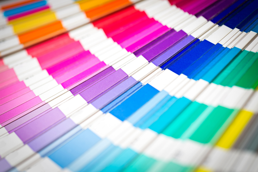
RGB (Red, Green, Blue) – Used for digital screens like websites, social media, and presentations. RGB colors are created with light, making them more vibrant.
CMYK (Cyan, Magenta, Yellow, Black) – The standard for printed materials. Instead of using light, CMYK blends ink colors to create the desired hues.
Why This Matters: If you don’t convert RGB colors to CMYK before printing, your final design may look dull or different than expected.
Pantone Colors: Precision Color Matching for Print
Pantone colors (also called spot colors) are pre-mixed ink colors designed to provide exact color consistency across different printing materials. They are commonly used for:
- Logos and brand colors that need to be identical across all materials
- Specialty items like packaging, signage, and branded merchandise
- High-end or corporate materials where color accuracy is critical
💡 Pro Tip: Pantone printing is more expensive than CMYK, so it’s best reserved for branding elements that require precise consistency.
How Printing Materials Affect Color Appearance
Even after selecting the right color system, the type of paper or material you print on can still affect the final result.
- Coated Papers – Glossy and semi-gloss paper reflects light, making colors appear brighter and more vibrant.
- Uncoated Papers – These absorb more ink, leading to muted or softer colors—often used for letterheads and business stationery.
- Textured or Specialty Materials – Surfaces like fabric, wood, or metal can alter ink absorption, creating unexpected color shifts.
💡 Why This Matters: If your brand uses both glossy marketing materials and uncoated stationery, you may notice slight color differences. To maintain consistency, adjust color values based on the material or request test prints before large-scale production.
Key Tips for Ensuring Brand Color Consistency in Print
Before sending your brand materials to print, follow these best practices:
- Convert RGB/HEX to CMYK early – Avoid color shifts by ensuring your designs are in the correct format before finalizing.
- Use Pantone colors when precision is needed – For high-consistency branding, Pantone is the best choice—but keep in mind the higher cost.
- Request print proofs – Always ask for a printed sample before placing a large order. Digital previews aren’t always accurate!
- Consider material choice – The texture and coating of your paper or packaging can impact color vibrancy. Choose wisely.
- Talk to your printer – Printers can help adjust color values based on material and ink absorption.
No color reproduction is perfect, but by understanding how colors translate in print, you can make informed choices to keep your brand’s visuals as consistent as possible.
Not sure if your brand colors will print as expected? Let’s make sure your visuals are consistent across all mediums. Schedule a free Call with our Brand Strategist to get expert advice on color selection and print accuracy!

The First Step to a Thriving Private Practice: Why You Need a Business Plan
Creating a business plan might feel like extra work, but it is worth the effort! 1. Clarity...
What’s Your Brand’s Personality? Understanding the 12 Brand Archetypes
Quick Summary: Brand archetypes give your business a distinct personality that helps attract...

The Art of Brand Customer Attraction: How to Draw Your Ideal Audience
Have you ever wondered what makes customers truly connect with a brand? It’s not just about...